Friday, January 31, 2014

The Lost Colossus - Process

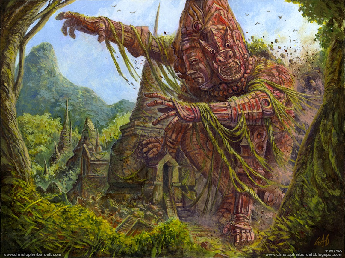
Today on the blog I have for you the process that went into my very first traditionally painted piece that was completed for a client. I am of course referring to the mighty Lost Colossus that was for the Legend of the Five Rings: Gates of Chaos expansion. Somehow this one slipped through the cracks. I painted this in late 2012 and the piece was released in August of 2013 (if I remember correctly). Here is for the final piece turned out to refresh your memory...

The Lost Colossus
12 x 16 - Acrylic on board
Gate of Chaos expansion
© 2013 Alderac Entertainment Group

Like every other pieces that I create the Lost Colossus began with a thumbnail stage. Unlike the rest of the pieces I create there was pretty much just ONE thumbnail that I was working with. I REALLY knew what I wanted to do with this piece and before sketching I took a ton of reference photos that I cobbled together to make myself into a four armed three faces giant statue. I really don't recommend doing just one thumbnail... but I have had a really great working relationship with Adrian over at AEG and I was confident that I was moving in the right direction with this piece. I spent a lot of time working out the concept to make sure it was the way I wanted it before turning it in...

The Lost Colossus - Thumbnail
© 2013 Alderac Entertainment Group

I did not make a mistake and my gamble paid off... the thumbnail was approved without issue. Now that I had an approved thumbnail and loads of reference... I was ready to begin the drawing. Since I was planning on creating this traditionally I knew I needed to have a really solid worked out drawing. I did not have the luxury of being able to make revisions and changes on the fly like I can working digitally. I took my time with the drawing and worked everything out...

The Lost Colossus - Drawing
© 2013 Alderac Entertainment Group

The drawing was rejected and I had to start over from the beginning...

Just kidding. The drawing was approved and I was ready to start smearing mud around with stick... and boy, was I nervous about that prospect. At this point in my career when I am ready to start my digital paintings I am mentally already two or three steps into the process working things out and making decisions. I don't really have any fear or worry about the prospect of the painting... maybe something in a piece will need some extra attention, but I know without a doubt that the piece will see the finish line. Not so much with the traditional work yet. I am really hesitant to begin as my mind is filled with everything that could go wrong... including the whole painting going down the tubes. In the process of creating a traditional painting I eventually get to a point where I know it will be alright, up until then though... it is nerve wracking. Here are a bunch of images of the painting coming together...

The Lost Colossus - Process steps
© 2013 Alderac Entertainment Group

In just 15 easy steps you too can have a Lost Colossus... or not... In the end this was a very successful test for myself and I was very happy to have faced the challenge. It at least gives me the encouragement that I can create a traditional image on a deadline ... and not die. I am still not anywhere near a 100% success rate with my traditional pieces yet. As mentioned elsewhere, I attempted to create my next two L5R assignments traditionally and had to abandon both and had to complete them digitally. Live and learn! As of right now I am working on my third traditional piece for a client... here it hoping this one makes it over the finish line!

Again, here is how the final painting turned out as well as the final production card that it was made for...

The Lost Colossus
12 x 16 - Acrylic on board
Gate of Chaos expansion
© 2013 Alderac Entertainment Group

The Lost Colossus - In handy card form

That is all for another exciting week on the blog, see you back here on Monday for a BRAND NEW MONSTER! RAWR! Until then...

For more samples of my work or to contact me regarding my availability head over to my website: www.christopherburdett.com

Wednesday, January 29, 2014

Raluk Moorclaw, The Ironmonger - Warmachine - Privateer Press

Holy cow! Straight from 2011 the very first miniature I ever designed for Privateer Press is NOW finally out! Can't believe it has been this long... 2011... how times files, and talk about production schedules. So thoses that play Warmachine can now enjoy the mighty Trollkin Mercenary, Raluk Moorclaw...

Raluk Moorclaw, The Ironmonger
© 2014 Privateer Press

Besides a pose change the design seems to have made it through the production intact. Which is always nice! Here is how the final production turned out...

Raluk Moorclaw, The Ironmonger final production miniature
(Image courtesy of Privateer Press)

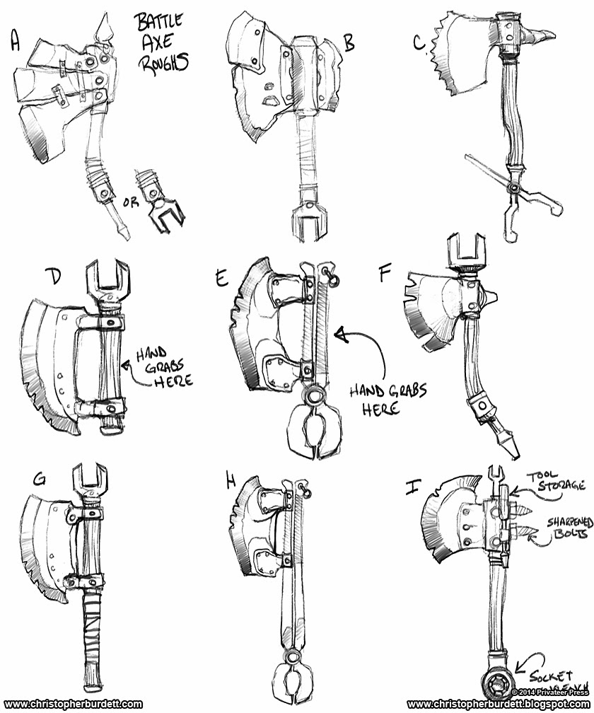
Since this was my first piece for Privateer Press... and it was done like a million years ago in the life span of making monsters I am not sure I really have any great or witty stories to share about this piece. I spent most of my time while working on this by getting use to the IP, the art director, and the whole process for making miniatures for Privateer Press. What I can share with you is a WHOLE ton of concepts, roughs, and monster man drawings...


Various Raluk Moorclaw, The Ironmonger roughs and concepts
ALL are © 2014 Privateer Press

That is all for another exciting Wednesday on the blog, see you back here on Friday! Until then...

For more samples of my work or to contact me regarding my availability head over to my website: www.christopherburdett.com

Monday, January 27, 2014

The Droid's Task - Star Wars: It Binds All Things

Over on the Fantasy Flight Games website last week they previewed the newest expansion to the Star Wars Card Game, It Binds All Things. In that preview they showed off a card that I have in this expansion! The long and the short of it is: IG-88 + Jabba's Palace + Rodian = The Droid's Task!

The Droid's Task
© 2014 Lucasfilm, Ltd. TM Lucasfilm, Ltd. Under license to Fantasy Flight Games

The Droid's Task in handy dandy card form

When this expansion is officially released I will share the process step and some back story related to its creation. There were some revisions as well as some back and forth with production regarding certain elements... some of which that are no longer in this piece. More on all this in the fullness of time...

That is all for another exciting Monday on the blog, see you back here on Wednesday! Until then...

For more samples of my work or to contact me regarding my availability head over to my website: www.christopherburdett.com

Friday, January 24, 2014

Spectrum 21 and Artist Selfies

Well... it is Spectrum submission time again. I have written about spectrum several times before here on the blog and you can read more HERE. Not sure I have anything new to add about Spectrum this year save that I did in fact submit some pieces for consideration in Spectrum 21. ...against my better judgment.

http://www.spectrumfantasticart.com/
If you are going to submit to Spectrum 21 you better hurry, the deadline is today!

I have absolutely no anticipations or belief that my work will get accepted, but if I don't submit I know that it is 100% certain that I will not be accepted. Unfortunately, the pieces I was REALLY excited about submitting I have found myself unable to submit. The License for these images is held by a rather larger company and I tried to acquire the permission to submit to no avail. My art director on the projects tried their best... no luck. I will try again for next year. The pieces fall in a weird gray zone between years so they may be still eligible for submission next year. Oh well... Spectrum time again, time for the best of the best to be honored and I have already established that I am merely, and happily, Okay

Hey! On a more positive and fun note, Lauren Panepinto posted a great article about artists and their reference selfies. She got some really great artist to contribute their selfie reference photos and the final illustrations that they belong to and shared them over on Muddy Colors. You owe to yourself to go check out the fun, especially if you don't know about Muddy Colors and especially if you are not using reference!

http://muddycolors.blogspot.com/2014/01/artist-selfies-everybodys-doing-it.html
Selfies... everybody is doing it... why aren't you?

Lauren did a call out on Facebook for additional artist selfies and I could not resist because I have SO many of them. I am every monster I make... so I have just a few silly photos laying around. SEE, all these years of me preaching about using reference is not some personal cause, EVERYBODY uses reference. For my submission of a selfie I went with my piece I did for the D&D Halls of Undermountain book, Wroot the Goblin. It was a fun photo shoot and I am happy with how the final turned out...

  Ridiculous artist selfie and final Wroot the Goblin
© 2012 Wizards of the Coast

Again, take some time if you haven't already to go check out Muddy Colors and the artist selfies! RAWR!

That is all for another exciting week on the blog! See you back here on Monday! Until then...

For more samples of my work or to contact me regarding my availability head over to my website: www.christopherburdett.com

Wednesday, January 22, 2014

Trandoshan Rival Explorer - Beyond the Rim Process

Today on the blog I have for you the process that went into the making of (in my opinion) the best space lizards, a Trandoshan, for the Star Wars RPG book, Beyond the Rim. I shared this with you originally in September... how time flies. To get us back up to speed, here is how the final Trandoshan Rival Explorer turned out...

Rival Explorer
© 2013 Lucasfilm, Ltd. TM Lucasfilm, Ltd. Under license to Fantasy Flight Games

This is not my first nor will it be my last Trandoshan piece. I think there is a standing order still over at Fantasy Flight Games to give them to me if at all possible. They are one of my two favorite aliens from Star Wars... the other being the Mon Calamari, but I have mentioned this many times. I have lots of reference and years of familiarity with these guys so it is always fun to work on them. I got started with some thumbnails as always...

Rival Explorer - Thumbnails
© 2013 Lucasfilm, Ltd. TM Lucasfilm, Ltd. Under license to Fantasy Flight Games

Nope, totally not standing in the yard dressed in what I imagined a Trandoshan explorer would where... nope, TOTALLY not happening. At the time I think I was leaning more toward option 'B' after being really excited about option 'A'... but it didn't matter, option 'A' was the winner with the client. With a selected thumbnail in hand it was time to get started on the drawing...

Rival Explorer -Drawing
© 2013 Lucasfilm, Ltd. TM Lucasfilm, Ltd. Under license to Fantasy Flight Games

After all the right and perfect marks are made on the paper (HAHA!) I had myself a drawing of a Trandoshan... or should I say, another drawing of a Trandoshan. As I type this I keep looking back at option 'B' of the thumbnails and wonder, "What could have been". Oh well... moving on, no time to second guess the art directors.

With the final drawing approved it is now time to get started on some paint work! In just eight easy steps you too can have your very ownTrandoshan ! Or not...

Rival Explorer - Process steps
© 2013 Lucasfilm, Ltd. TM Lucasfilm, Ltd. Under license to Fantasy Flight Games

Another straight forward piece to paint. I think the only note on this piece was at the end I needed to shorten the height of his face between the lib and nose. I just had to shift his face down and it was a quick fix. Not that understood why this was an issue, but it is not my job to question, just to make sure the client is happy with the final product. RAWR!

Again, have you ever wondered what one of my paintings looked like at 100% at its original size? Well, here you go! The original is 9x11 and is 300 dpi. Here is a crop of the face / shoulder area, at 72 dpi this section now measures over 14x14. You can compare this close up to the close up I recently posted on the Nexu, which was from this same project. Hurm... I feel like I could have put another layer of time and work on this piece... oh well, too late now!

Rival Explorer -Painting at 100%
© 2013 Lucasfilm, Ltd. TM Lucasfilm, Ltd. Under license to Fantasy Flight Games

While not printed nearly as large on the page as the Nexu, this Trandoshan ended up much larger on the page then expected. Good thing I paint big! Remember, you can never make the painting too big, but a painting can definitely be too small... and then there is a problem not easily fixed. YES, you can loose information in a big painting... but that is no where as bad a providing a image to the client that is too small to use or looks horrible when they up-res it.

Rival Explorer hanging out with some text...

Again, here is the final Trandoshan Rival Explorer for your viewing pleasure... RAWR!

Rival Explorer (this continues to totally not be me standing in the yard dressed this way)
© 2013 Lucasfilm, Ltd. TM Lucasfilm, Ltd. Under license to Fantasy Flight Games

That is all for another exciting Wednesday on the blog, see you back here on Friday! Until then...

For more samples of my work or to contact me regarding my availability head over to my website: www.christopherburdett.com

Monday, January 20, 2014

AGoT - A Hidden Agenda - Viserion, Drogon, and Rhaegal

When you get the email that asks if you are available to work on a project because George R. R. Martin asked for you, by name, to paint some more dragons for the A Game of Thrones card game... you make time in your schedule. This happen last January and it is still a little surreal. My schedule was also rather full at the time, but this is one of those times you make the time and you do the work. A year later I can finally talk about this weird chain of events and share the dragony results. I present you with a second pass at Viserion, Drogon, and Rhaegal...

Viserion - A Hidden Agenda
© 2014 Fantasy Flight Games

Drogon - A Hidden Agenda
© 2014 Fantasy Flight Games

Rhaegal - A Hidden Agenda
© 2014 Fantasy Flight Games

Back in 2010 I painted these three dragons for the first time for the Queen of Dragons expansion and they were very well received. If you are unfamiliar with those pieces, you can see them here: Viserion, Drogon, and Rhaegal. For the Queen of Dragons expansion I was given a lot of leeway to give them my own personal spin, as long as I followed the general description found in the books. Which is good since at the time I was not very familiar with the novel and world the Mr. Martin was creating. I was just wanting to make cool dragons. With my return to paint new versions of the dragons I did had approved designs I needed to stick to, but I also had several years more experience so that I could approach the dragons with a fresh pair of eyes. The dragons were to be depicted a little younger then I originally painted them, but I am not sure if that really came across. Again, really more concerned in painting cool dragons. With as much as I did to maintain the look and feel that I had with them originally, I did make sure to correct some anatomical and detail issues that bothered me about those original dragons. When I do my process post for these I will compare the originals to these new versions and talk about what and why I made changes.

Here are how the final production cards turned out and you can see how they were cropped down for production...

Viserion, Drogon, and Rhaegal in handy card form! RAWR!

The back of the card packaging features the Drogon piece very nicely, I may not be on the front of the package, but I am rocking the back of it...

Drogon is hiding out on the back of the package... RAWR!

These three new versions of the three dragons really got me thinking, and by the time the Illustration Master Class rolled around last year I still had dragons on my mind. When one of the assignments turned out to be A Game of Thrones related I took the assignment without hesitation. I really wanted to see how I would have completely redesigned the dragons if I had the chance. If you followed my posts about IMC last year you my remember how the final product turned out...

The Three Dragons
24 x 14 - acrylic on board
© 2013 Christopher Burdett


That is all for another exciting Monday on the blog, see you back here on Wednesday! Until then...

For more samples of my work or to contact me regarding my availability head over to my website: www.christopherburdett.com

Friday, January 17, 2014

Crazy Talk

My coworker at the day job who supervises the audio/video department was doing some tests with Crazy Talk to see what options it could offer us to quickly create animated characters. He asked if I had any monster drawings available to test on and I was all too happy to provide some. A very short time later this was happening...

Crazy Talk just make Cyvus Vail that much wackier...

In a couple of clicks the program added the eyes and teeth and after rigging the mouth it handles all the lip sync on the fly. These two segments of audio are built into the program but I understand it will sync to your own recordings. The program creates the 3D illusion and I have to say that for an off the shelf program I am impressed. Unfortunately, at the day job we will not be doing any animated demons anytime soon, but it could be a resource to have. If only we had this eight years ago...

If you were wondering what this drawing is from, it is my Cyvus Vail redesign from 2011. Vail was originally created for the Angel TV show 10 years ago...

Cyvus Vail redesign
© 2011 Christopher Burdett

That is all for another exciting week on the blog, see you back here on Monday for... DRAGONS! Until then...

For more samples of my work or to contact me regarding my availability head over to my website: www.christopherburdett.com

Wednesday, January 15, 2014

Star Wars: Balance of the Force

For the last couple years I have been doing my best to make every assignment "mine" and today I have for you the first of my Star Wars pieces really that fits the bill. I have been looking forward to sharing this since last March and it should be a representation of things to come. The most recent expansion to the Star Wars card game, Balance of the Force, is now out and I have one new card, the Arcona Rumor Monger, in this expansion...

Arcona Rumor Monger
© 2014 Lucasfilm, Ltd. TM Lucasfilm, Ltd. Under license to Fantasy Flight Games

I mentioned on Monday in my look back at 2013 about how I have been working to carve out a section of the Star Wars and D&D universe and tell that part in my voice... well, this is one of those Star Wars pieces.  The assignment was to depict a seedy bar where an Aronan rumor monger leans forward to tell the viewer some juice gossip. That is a fairly open assignment and this piece could have gone in any direction. I could have easily put the Arcona up against a wall or other generic backdrop... but that was not the piece I wanted to create. I wanted to start building my Star Wars world. Since an Arcona appears in the cantina in Star Wars: A New Hope, I wanted to include a bunch of other cantina aliens in this piece. Before I get too far ahead of myself, let's have a look at the final production card so you can better see what and why I did what I did...

Arcona Rumor Monger in handy card form and a lot less background

Yup... the chrome of the card template covers up EVERYTHING that I put in there that was mine. I knew this going into the assignment and it in a way made me more determined to do it. I put all that back there for my needs as an artist and as a fan of Star Wars... not for the client or the people that play the game. I know it is back there, that part in mine. It might seem a little weird to do this, or perhaps a waste of my time and energy... but I know I made the right decision and it has lead to me doing more of this. I have been pushing pieces further then expected and doing more with them. It has gotten me reinvigorated about creating more complex visual worlds and pieces.

If you were wondering what was written in Aurebesh in the background and on the datapad, it is the name of bar, "Ric's". Worked with the folks over at FFG to get a suitable name for this bar that would be approved and add some flavor. Also, if you think this Arcona looks a little familiar... well, his face did sneak into another recently Star Wars piece that I shared back in October.

I did specify above that I have one NEW card in this expansion, but it turns out that there are two card in the expansion with my art on it. Apparently a pair of wily Trandoshans that I first painted for the SW RPG core book have surfaced again, they do get around...

Oh hai, Trandoshans... glad to see you guys made it...

If you had forgotten or missed it before, here is how the original piece of those two Trandoshans turned out...

AT-PT ...and apparently Trandoshan Security Team
© 2013/2014 Lucasfilm, Ltd. TM Lucasfilm, Ltd. Under license to Fantasy Flight Games

That is all for another exciting Wednesday on the blog, see you back here on Friday! Until then...

For more samples of my work or to contact me regarding my availability head over to my website: www.christopherburdett.com

Monday, January 13, 2014

2013 - It is okay to be "OKAY"

2013 feels like a distant memory already. My days currently are very full with life events and monsters and I could have easily overlooked doing this post as I look ahead at 2014. It is not like I haven't other more time sensitive things to do right now, but I feel somewhat amiss in not document and share what I have learned from the ups and downs of 2013. Where to begin? I feel there is so much to share about 2013… but it really can be summed up in six words: It is okay to be "OKAY"… and the credit for this goes to Ralph Horsley. Before I look at these six little words, let's have a look at some other take aways from 2013…

It builds and builds AND builds on itself.


More so in 2013 then previous years I have observed just how much everything I have already shared from my journey has continued to be relevant, useful, and topical to my current life as a monster artist. If you missed my previous posts you can see them here: 2009 Part 1 & Part 2, 2010, 2011, and 2012. I am not aware of anything from my earlier posts that is not currently affecting my choices and the way I look at my life as an artist. Over the years I am peeling back the layers to realize the complexity of all this… gaining experience… leveling up… as it were. The direction of my journey might meet a dead end, a goal might be achieved, a clients might drift away, but I find a new path, another goal takes its place, a new client it discovered. The skills and understanding to see how this all works and to take an active roll in these events has been building over the years and continues to build. It is layered… like an onion, but all the layers work together to create a whole and all the layers continue to be important and relevant. 

Like the mighty stock photo of a block tower the knowledge gained over the years apparently has been building and building into a mighty experience tower... or something like that.

The strength of saying "NO".

I have seen a lot of people taking about this and a lot of discussion about its importance. Just for the sake of my own sanity and happiness I have had to get firmer with my usage of saying "NO". There is a finite about of time that I can devote to my wife, my day job, my friends, various other interests and hobbies, sleep, and making monsters. More then not, these last eight or nine years, making monsters has come quickly after the day job and has not allowed much if any time for anything else. Just like there being a finite about of time in the day there is a finite duration of time that someone, namely me, can live their life this way. I have had to say "no" because I just need more time to live my life, see my wife, and heaven forbid, make art for myself. I am still really busy, sometimes feeling extremely overloaded, but it is on the projects and assignments I want, not on just what comes along. With saying "no" more I have not been filling my schedule with a lot of low pay assignments and have been able to take on fewer higher paid assignment that are more rewarding on every level. At some point you just have to make the decision that your time is worth more then an assignment, especially a low budget uninteresting assignment. My time relaxing, playing a video game, drawing something for myself, or spending an evening with my wife has become more precious to me then a lot of assignments. This can still be hard to practice, but I am working on it and I am changing the way my time is used.


Back to the beginning.

With my time becoming more important and more precious to me I have had to evaluate what I want to create with the time I give to making monsters. This year especially, I have been looking back at the things that led me to this life of making monster. There are four things that take all the credit, Star Wars, Dungeons & Dragons, Godzilla, and Ultraman. While I have yet to find my personal voice regarding Godzilla and Ultraman, I have been able to find an outlet both professionally and personally for my love of Star Wars and Dungeons & Dragons. 2013 brought me a lot of professional satisfaction for both of these but it was not enough and I have been devoting a lot of personal time to them, especially Star Wars. I have been exploring just what Star Wars means to me and taking a fresh look at the elements that really stimulate my creative drive. I have only done a handful or pieces so far, and I have only shared one or two, I am really looking forward to further exploration. I have had a long and complex history with my fandom of Star Wars and this is not the place to delve into it, but let's just say that after taking a break from that universe I have been able to return to it with fresh eyes and a better understanding of my feelings about it. Is this "ART"? Probably not, but it is "art". It is also MY art and I am finding a renewed happiness and excitement being able to play in the Star Wars and Dungeons & Dragon universe and carve out a piece of it that is told with my voice.

"Jabba's Gang"
11 x 14
colored pencil on toned paper
© 2013 Christopher Burdett

It is okay to be "OKAY"

This more then anything is what I take away from 2013.

After a lot of earlier conversations about art and being a working artist, Ralph Horsley came up to me during some evening festivities during Gen Con and said to me, "It is okay to be "OKAY"." I did not get it immediately, but I have been thinking a lot about it ever since. It has made the ups and downs so much easier to weather this year and has giving me a better perspective on myself and my career. Basically, my take away from these six words is that if you are getting work, making a living, doing everything you need and want to do… then you are doing "OKAY". Not everybody can be Brom, not everybody can be Greg Manchess, not everybody can be Frank Frazetta, not everybody can be Julie Bell… we are ourselves and that is "OKAY". We can not all be "FAMOUS", but we can do a great job at making our art, pleasing our clients, and living our lives the way we want to live them.

Gen Con 2013 fun... enlightenment comes in unusual places and unexpected times...

I am not saying to forgo dreams, goals, hopes, or wishes… but I am saying that we can be happy and proud of what we have and what we do and the fact that being "FAMOUS" (whatever that really means) doesn't have anything to do with feeling good and happy about our abilities and accomplishments. I don't think that being "FAMOUS" has ever been necessarily a goal for myself, but there is a certain level of inclusion and recognition that comes with being "FAMOUS" that would be nice. I have been coming to terms and to celebrate that in many ways I am a really "OKAY" artist. I have plenty of work, I have clients that want to give me work, I put all of myself into each piece, and I have done more and reached higher then I ever thought possible for myself. By celebrating being "OKAY" I am focusing on what I have and not at what I do not have.

"Loathsome Catoblepas" - Magic the Gathering - Theros
© 2013 Wizards of the Coast

I have wasted a lot of time fixating on not being included on specific projects, not being the darling of a particular art director, not having an army of ravenous devoted fans… and what has that gotten me? It has not found me a place on a coveted assignments, caught the attention of a reluctant art director, or widened my fan base… it has gotten me a HUGE amount of stress and unhappiness. By coming to terms with being "OKAY" it has really freed up so much brain space and I think it has allowed me to do more and reach farther. I have worked with several new art directors on some really exciting projects in 2013 and I can't wait to share them with you… and all this has happened since Gen Con.

I am trying to shift from worrying about what I don't have and what I am unable to achieve to being reassured by what I do have and what I have accomplished. My goals, my hopes, and my dreams have not changed. I am acutely aware that I have done things in my career that others will only ever dream of and I take great solace in this. I know it is easy to scoff at someone claiming that they are just "OKAY" after they have done some of the things I have done… I know a few years ago I would have certainly scoffed. SCOFF SCOFF! BUT… Perspectives change. Understandings of the ins and outs of the industry change. An assignment from a client does not make me any more or less of an artist. Fans buying my prints does not make me any more or less of an artist. Assignments from clients are great and people wanting to give me money for my art is great! …but this should not change how I see myself and the quality of my work or the drive to make work.

Bestiary: Lost World - Dragon Magazine Issue 427
© 2013 Wizards of the Coast

Being "OKAY" is a really good place to find myself and I am becoming more and more aware of this. It does not change anything about my work or my career, but it does improve my outlook and confidence in who and what I am. Many thanks goes to Ralph for this bit of wisdom, it certainly has left me with a lot to think about.

Wrapping it all up…

Usually at these point I sum everything up again and maybe have a few additional words of advice… instead I will say, ...it is okay to be "OKAY" and DRAW MORE.

If you have any questions or would like me to clarify anything, let me know. I hope my ramblings have been helpful, useful or at least mildly amusing. I hope 2013 was a good year for you and here's to 2014 being even better

That is all for another exciting Monday on the blog, see you back here on Wednesday! Until then...

For more samples of my work or to contact me regarding my availability head over to my website: www.christopherburdett.com

Friday, January 10, 2014

One Fantastic Week

If you have not heard about it, Peter Mohrbacher and Sam Flegal are doing something pretty cool over on Google Hangout. They are doing a weekly live chat where they talk about the previous week working as fantasy artists. They talk about what they are working on, the ups, the downs, they answer questions, and for some reason on their December 23rd live cast... they had me on as a guest! RAWR!


If you would like check out more you can see them over on youtube or on Pete's Google+ page. They are up to 7 episodes and in the most recent episode they invite on Sean Andrew Murray as a special guest. I strongly encourage you to check it out! I have known Pete and Sam for a number of years now and can't speak highly enough of them as people, artists, and businessmen.

That is all for another exciting week on the blog, see you back here on Monday! Until then...

For more samples of my work or to contact me regarding my availability head over to my website: www.christopherburdett.com

Wednesday, January 8, 2014

Nexu - Beyond the Rim Process

Today on the blog I have for you the process that went into the making of one bad space kitty, the Nexu, for the Star Wars RPG book, Beyond the Rim. I shared this with you originally in September... how time flies. To get us back up to speed, here is how the final Nexu turned out...

Nexu
© 2013 Lucasfilm, Ltd. TM Lucasfilm, Ltd. Under license to Fantasy Flight Games

Since the Nexu is an established creature there is a lot of reference out there to make sure to looks accurate to what was on screen in Star Wars: Episode II. That said, it is amazing how much inaccurate reference out there. From my experience with film production and manufacturing constraints it looks like the Nexu went through a final set of revisions for the movie after "approved" designs were sent out to the toy and product companies. If you look hard enough you can final some very different looking Nexu. After negotiating the Nexu reference I was able to gather film accurate resources to work from and I got to work on some thumbnails...

Nexu - Thumbnails
© 2013 Lucasfilm, Ltd. TM Lucasfilm, Ltd. Under license to Fantasy Flight Games

As a rule I usually submit a minimum of three thumbnails for any project, but sometime for these isolated figures two thumbnails are enough (this is after years of working in general in addition to having lots of experience working on a specific license and with specific art directors). After thumbnail "A" I thought I nailed it and then I did thumbnail "B"... and then knew I was totally wrong about my initial thoughts on "A". Maybe if "A" had more of a curve to the body like a pouncing cat it would have worked batter... but it is very stiff. Oh well. Needless to say "B" was picked and I was given the blessing to move forward with the drawing...

Nexu - Drawing
© 2013 Lucasfilm, Ltd. TM Lucasfilm, Ltd. Under license to Fantasy Flight Games

The drawing came together quickly and was approved without incident. While rare, there are times when an issue comes up after the final drawing is completed. At this stage of the process I am really starting to gear up to start working, so any big revisions to the drawing can sometimes throw me off my game for the painting. Thankfully it is VERY rare.

With the final drawing approved it is now time to get started on some paint work! In just eight easy steps you too can have your very own Nexu! Or not...

Nexu - Process Steps
© 2013 Lucasfilm, Ltd. TM Lucasfilm, Ltd. Under license to Fantasy Flight Games

Again, really straight forward piece that come together quickly. With no environment, being a single figure, and having rather generic lighting these isolated pieces can come together very quickly. There was one note at the end after it was submitted to tweak the lighting on the tail... but I can barely figure out now what I did or was asked to do.

Have you ever wondered what one of my paintings looked like at 100% at its original size? Well, here you go! The original is 9x11 and is 300 dpi. Here is a crop of the face, at 72 dpi this section now measures over 14x14. You can see just how loose and how tight I work these days. As tight as it might look to some of you it is VERY loose to where I once was and have to keep myself from returning to...

Nexu - Painting at 1000%
© 2013 Lucasfilm, Ltd. TM Lucasfilm, Ltd. Under license to Fantasy Flight Games

I think the intended size of this piece was to be 4.5x 5.5. FFG asks for the pieces at 600 dpi or to make them double size at 300 dpi. I prefer to work on them at 300 dpi and will gladly make them at double dimension size. Why? Because you never know how the piece will be used and when the piece is nice and big this can happen...

Living large on the page... RAWR!

Notice anything about the tail in the final printed book? Hmmmm.... I wonder why that choice was made after I turned in the work? It is theirs now, they can do whatever they would like with it! Again, here is how the final Nexu turned out on my end of the process....

Nexu
© 2013 Lucasfilm, Ltd. TM Lucasfilm, Ltd. Under license to Fantasy Flight Games

That is all for another exciting Wednesday on the blog, see you back here on Friday! Until then...

For more samples of my work or to contact me regarding my availability head over to my website: www.christopherburdett.com