

The Burning of Lake-Town #1 (Smaug the Terrible)
© 2012 Fantasy Flight Games
I think I mentioned before that there was a really fast turnaround for these and time was of the essence at every step of the way. Since I had all ready designed and done a couple illustrations of Smaug for a yet to be released Hobbit expansion my AD wanted me back to do these Smaugs as well. It was hard to say no... in fact I didn't say no, I said yes... but I had to hit the floor running to make sure that I got them all finished up on time. I started these all off as I always do with thumbnails, but most of the ideas of what these needed to be was worked out via instant message and I had a bit of elbow room to just make them cool. Instead of detailed descriptions I was given the game mechanic idea that the cards needed to convey and I went forward with the thumbnail. This first card needed to be an "area / fire attech". I knew instantly what it needed to be...

The Burning of Lake-Town #1 - thumbnail
© 2012 Fantasy Flight Games
I only did the one thumbnail and it was approved. I usually do an minimum of three thumbnails for any piece, but most of the details were worked out verbally and I was confident that I was going to hit the target with the first shot. You will notice that there are two cropping boxes on the thumbnail. The small square is the proportions for the final card art that will be used while the larger rectangle shows the AD the piece I intend to make for myself. With the thumbnail approved I moved forward on the final drawing...
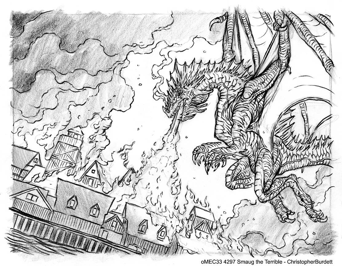
The Burning of Lake-Town #1 - drawing
© 2012 Fantasy Flight Games
Even though I had already designed Smaug for a couple previous pieces I felt there was room to more flesh out my design and give the old dragon a little more room to live and breathe. I didn't change my original design, but I did add to it, flesh it out as it were. Hopefully when all the pieces are compared to one another they will feel one and the same. I had to crank out these drawings really quickly, but they were all approved to move forward and that is what I did. I was about to leave for the Illustration Master Class but I was still moving production along on these. I got the under painting completed before heading out to IMC, but to be honest I just was not happy with it and not feeling really optimistic about where the piece was heading. In fact I was a little worried that I had three dragon paintings ahead of me and not a clear focus on what I was going to do with them. Here is that first attempt on the under painting...

The Burning of Lake-Town #1 - under painting #1
© 2012 Fantasy Flight Games
I have previously mentioned my ups and downs at IMC this year with my poorly timed sickness. What I might not talked about too much was the hour and a half talk I had in the studio with Peter Mohrbacher. Pete spent a little time at my computer before I collapsed and gave me some tips and suggestions on how to go about building up my paintings differently and how to get more out of my efforts. It could have been the mental fog of the sickness, but my mind was blown at what Pete showed me and my eyes were opened to the possibilities. When I returned from IMC and was back on my feet I got to work with renewed energy on three dragon paintings. Here is a progress progression of the first piece...

The Burning of Lake-Town #1 - process
© 2012 Fantasy Flight Games
In the past most of my paintings would go from step 1 directly to step 5, but now I was spending more time building up a stronger value study under the color. I am not a big fan of doing digital color washes over a black and white painting. It was a method I employed early in my career and I now don't really like the look it gives. Some artists handle it beautifully, but I never felt that I did. With this new build up of layers you can use a grey scale more effectively... IMHO. The drawing is 100% the same as I have described in all my other posts, the middle grey is a multiply layer, the grey tones are a soft light layer, the color gradient is also a soft light layer, and the under painting (step 5) is a hard light layer. After this the painting is handled 100% the same as I would handle any other painting. What this new build up has giving me is a more dense, more complex color under painting that has better value and more interesting colors. Here are the two under paintings compared side by side...

The Burning of Lake-Town #1 - under painting comparison
© 2012 Fantasy Flight Games
The image of the left was my original under painting and the image on the right is the under painting created from this new method. Look at what the is happening with the lines from the drawing in each image and look at what is happening in the lower right corner and in the building in the foreground. The values, hues, and saturation are all much more to my liking and much stronger in the right image. By using the image on the right so much more of the guts of the piece are worked out and established and I will end up spending less time figuring things out and fighting with color and value. This has been a profound change in my work and how I go about building up my paintings. Still a lot to learn about this new method, but it already has been extremely beneficial.
Here is how the final piece appeared on the card, you can compare the cropping to my original thumbnail. As a side note, this piece actually got featured on two cards. Since I provided a larger image then I needed to the extra was turned into another card...


There is no way to know what the final painting would have looked like if I had used my previous painting process, but I feel that it would have been a greater struggle to reach the desired goal. Better results through quicker and better techniques is always nice... but I find that understanding WHY they work and WHY you are doing them is as important, if not more important.

The Burning of Lake-Town #1 (Smaug the Terrible)
© 2012 Fantasy Flight Games
That is all for another exciting day on the blog, see you back here on Friday! Until then...
For more samples of my work or to contact me regarding my availability head over to my website: www.christopherburdett.com
Thanks for this post, as you know i have been trying some different methods tweeking things around here and there, and I like the points you made about the underpainting (an area I tend to have trouble with) I look forward to test some of this out myself.
ReplyDeleteYou are most welcome. I hope you find it helpful! :)
Delete