Friday, May 28, 2021

REMINDER: Kickstarter Roundup - Hooker

When I wrote this post yesterday, the theme was to rally the troops to create a strong push and to get Daniel Hooker's Mermaid Mayhem: A Deep Sea Card Battle for Glory Kickstarter across the funding goal. It didn't have far to go with four days remaining. As I was looking at the campaign page to see what else I could share about this awesome game, the pledged amount ticked over the goal and it became funded! I was so excited to have been there to witness the campaign meet its goal. 

But that is not all; I awoke this morning to now see that the campaign has now also reached its first stretch goal—exciting times in the last days of the campaign. If you have been on the fence about supporting this project, now is the time to act. There are many more stretch goals available that will make this game that much more fun. I hope you take the time to go check out Daniel's Kickstarter and how it some love!


Stretch goals aplenty! I have my hopes on the Meme-maid cards getting unlocked before Monday. Those look like a lot of fun.

We have known Daniel for years, and he is a local artist that has made comics, mermaids, monsters, and more. On top of that, he is an all-around great guy, and I am always eager to support his projects, and I think you should too. Daniel has created a series of inclusive mermaid art for the last several years, and now he has created an entire mermaid game! I couldn't be more excited. 

"Mermaid Mayhem is an exciting card based adventure for ages 8 and up! Take your mermaid battle squad on a danger filled treasure hunt. Grow your party and punish your foes as you race to claim the most treasure."

There is more information, art, and many tiers to support this project on the campaign page. Now that Daniel's game will be a reality, it is time to unlock more stretch goals!


Just a glimpse of what in instore, be sure to head to the campaign page to learn more about this awesome game!

That's all for another exciting week on the blog. See you back here next week! Until then... 

For more samples of my work or to contact me regarding my availability, head over to my website: www.christopherburdett.com

Wednesday, May 26, 2021

Dungeons & Dragons - Van Richten's Guide to Ravenloft - Part 2

On Monday, I shared the first of two posts of my work from the new Dungeons & Dragons supplement, Van Richten's Guide to Ravenloft. Today brings the second post and the mighty Unspeakable Horror. This monster was a particular joy to design and paint. While there was a loose description provided, a lot of it was up to me to work out. I remember the need for its body to look and feel like old rotten wood and that it needed to have a crown of parasitic worms or caterpillars. All I know is that I needed to make an Unspeakable Horror, and I was more than happy to oblige. Here is the final painting for the Unspeakable Horror.

Unspeakable Horror
Van Richten's Guide to Ravenloft
11 x 14 - Digital
Art Director - Kate Irwin
© 2021 Wizards of the Coast LLC

The final painting may be digital, but there is, as with all of my D&D work, an original drawing available of this monster. I was especially pleased with the drawing for this one and gave it additional time and attention. Partially due to the complexity and partly because I was enjoying myself. Here are the drawings for the Unspeakable Horror.


Unspeakable Horror  - Drawing
 Van Richten's Guide to Ravenloft
11 x 14 - Pencil on paper
Art Director - Kate Irwin
© 2021 Wizards of the Coast LLC

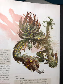
Lastly, here is a look at the Unspeakable Horror in the book. It printed beautifully. I really like the red graphic element behind the figure; it complements the piece nicely. As always, fingers crossed that there will eventually be a miniature made for this monster.

 
Unspeakable Horror in book form!

That is all of another exciting Wednesday on the blog. See you back here on Friday! Until then...

For more samples of my work or to contact me regarding my availability, head over to my website: www.christopherburdett.com

Monday, May 24, 2021

Dungeons & Dragons - Van Richten's Guide to Ravenloft - Part 1

Last week a new Dungeons & Dragons supplement was released that I have been looking forward to for some time. Van Richten's Guide to Ravenloft is a deep dive into the world of Ravenloft for D&D 5th Edition, and I was lucky enough to create a couple of paintings for the book. This is the first time working in Ravenloft, and it only left me wanting more. For both monsters, I was asked to design them and illustrate them, which, if you follow my blog at all this is my favorite type of project. 

For the first of two posts, I bring you the Carrion Stalker. It was described as an alien horseshoe crab resting upon a mass of tentacles that pulled itself around with pincers. This sounded right up my alley, and I enjoyed working on this one from start to finish. When I share the process for this piece in the coming weeks, I will share how I deviated from my established workflow and how it caused me a bit of a headache. Here is the final painting for the Carrion Stalker.

Carrion Stalker
Van Richten's Guide to Ravenloft
11 x 14 - Digital
Art Director - Kate Irwin
© 2021 Wizards of the Coast LLC
 
While the final painting is digital, the painting was not the only image created and used for this assignment. I was asked to also create a drawing of the underside of this monster to help illustrate its horrifying anatomy. In addition to the drawing used for the painting, there are two fully rendered drawings of the monster's underside. An original version required revisions due to the arrangement of the mouth and the final version that appears alongside the painting in the book. The mouth change came late after the thumbnails and designs were approved, which is why there are two versions. Because all of these drawings are related to the same monster and assignment, I am offering them as a set. Here are the drawings for the Carrion Stalker.
 
Carrion Stalker  - Drawing
Van Richten's Guide to Ravenloft
11 x 14 - Pencil on paper
Art Director - Kate Irwin
© 2021 Wizards of the Coast LLC
 
Carrion Stalker  - Underside drawing original
Van Richten's Guide to Ravenloft
11 x 14 - Pencil on paper
Art Director - Kate Irwin
© 2021 Wizards of the Coast LLC
 
Carrion Stalker  - Underside drawing final
Van Richten's Guide to Ravenloft
11 x 14 - Pencil on paper
Art Director - Kate Irwin
© 2021 Wizards of the Coast LLC

Lastly, here is a look at the Carrion Stalker in the book. It printed beautifully, and it is always nice to see my drawings in the book along with my paintings. I hope there will be a miniature of this one someday, though it will be a tiny mini.

Carrion Stalker in book form!

That is all of another exciting Monday on the blog. See you back here on Wednesday! Until then...

For more samples of my work or to contact me regarding my availability, head over to my website: www.christopherburdett.com

Friday, May 14, 2021

Blast From the Past - Concept Design for Harv the Barbarian (2004)

In 2004, when I still lived and worked in Los Angeles designing and making monsters for TV and movies, I did some design work for the never-made movie Harv the Barbarian. What is Harv the Barbarian, you might ask? Well, it was an unmade epic starring Rob Schneider and was co-written by SNL legend Jack Handey. You don't believe me? In digging through my archives and doing a little searching on the net, I found an article from 2014 regarding the script. In the article, it even mentions the "Mystery Worm of Atlantis, a sixty-foot-long, five-foot-thick worm that uses its ability to projectile vomit as a weapon, in the gladiator arena," which is the same monster that I did design work on. 

I am getting a little ahead of myself. By late 2004 I had worked in LA for some time and had produced a great deal of work for the shop I was exclusively working at. In all that time, I never received so much as a bonus or pay increase of any kind. If I wanted more, I worked more hours. Once again, I found myself asking my boss for some sort of raise to make the lean times out there more manageable. Again I was turned down for a straightforward pay increase, but I was allowed to work for free on my own time on concept designs involving a pitch for a new movie. If the shop got the movie, then I would get my raise. To be clear, I was asked to make unpaid spec work for my boss to get a job with no guarantee of composition for me. I was desperate and agreed. I did a great deal of work on a giant monster called the Mystery Worm of Atlantis that would fight Rob Schneider in a gladiator stadium. On the surface, it sounds fun and a great opportunity, except for that not getting paid part and being taken advantage of.

Long story short, I did a lot of work, like, a LOT of work. I produced a series of concepts for the Worm that I can no longer find and a final painting of the design that the boss picked. After all that work, nothing happened, the movie was never made, the shop never got the work, and I never got a raise. In early 2005 I left LA. This project was just one of the many reasons that led me to the decision. Here is the end result of all that work.

 
Mystery Worm of Atlantis Concept
Digital - 2004

Looking back now, all I can see is a bad painting of an almost interesting monster design that was executed poorly. I hardly knew anything about painting, let alone digital painting, in 2004. I had so much to learn, and thankfully, I learned a lot in the coming decade. I was in way over my head with this project, but I was desperate, and desperation sometimes provides the drive to break through your comfort zone and try new things. Sometimes desperation has you making poor choices like accepting spec work. There is no point in spending time breaking down everything wrong with this piece. I was much younger than I am now and knew a lot less. I can do much better now. That is hopefully how things should work. Let us look at this as a snapshot from September 2004 and the work I was doing in LA in the film industry. Here are a series of process images that I found in my archives.

 
Thumbnail
I will be honest; this thumbnail is my favorite part of the entire process and the work I did on it. There is better handling of the anatomy and composition here. There is a lot more movement over all that was lost as I worked on it.

 
Final pencil drawing
I might have this somewhere, but I have not seen this drawing since 2004, so it is likely lost.

 
The painting taking shape
I actually learned a fair deal working on this piece. A keen eye can see how the image changed and how different aspects evolved as I found better ways to work and improve what I was doing. I have no time or reason to do so, but I wonder how I would approach this monster and this painting today if I had to do it as the artist I am today.

That is all for another exciting week on the blog. I will be taking next week off on the blog, so don't expect anything new until the following week. Until then...

For more samples of my work or to contact me regarding my availability, head over to my website: www.christopherburdett.com

Wednesday, May 12, 2021

Kiddywidget - Dungeons & Dragons - Process

Today, I am happy to share the process and steps that went into one of my four illustrations in the recently released Dungeons & Dragons supplement, Candlekeep Mysteries. For this installment, I am sharing the companion piece to last week's post of the Skitterwidget. The Skitterwidget and Kiddywidget were a pair of pieces that needed to be adult and child versions of a mechanical dog-cockroach-like construct that the players would encounter. Here is the final painting for the Kiddywidget.

Kiddywidget
Candlekeep Mysteries
11 x 14 - Digital
Art Director - Kate Irwin
© 2021 Wizards of the Coast LLC

As previously mentioned, I designed the Skitterwidget and Kiddywidget in adult and child pairings. This way, production could look at the two versions and pick their favorites. I wanted them to have a familial connection and not look like two random robot creatures. Since I had free range with the design process, save for them being reminiscent of a mechanical dog-cockroach. I will say the Kiddywidgets were a bit more fun to design due to the challenge of making a cuter child-like version of the adult designs. While I don't do cute often in my work, I feel like I accomplished it well with this assignment. Here are the thumbnail pairings I submitted.

Kiddywidget - Thumbnails
© 2021 Wizards of the Coast LLC
 
Skitterwidget - Thumbnails
© 2021 Wizards of the Coast LLC

As before, I personally preferred the 'C' options, but the 'B' Kiddywidget was a close second. There was something about the 'C' Kiddywidget that I loved. With options 'B' as the approved thumbnails, it was time to move forward on the final drawing.

Kiddywidget - Drawing
Candlekeep Mysteries
11 x 14 - Pencil on paper
Original - SOLD
Art Director - Kate Irwin
© 2021 Wizards of the Coast LLC

As with the Skitterwidget, the drawings were approved, and I was ready to start painting. There were no further notes, and I was free to make the monsters come to life. Here is the painting taking shape.

Kiddywidget - Process
© 2021 Wizards of the Coast LLC

With the Skitterwidget painted first, I had a template to work from and adjust. Since I was now painting a child version, I wanted to be mindful of the level of wear and tear I put on the construct. I also wanted to make sure the overall piece was brighter and lighter. I shifted things more yellow overall and made sure the shadows were not as dark. I added a fair amount of blue and green into the piece to keep it bright and colorful. While I am not sure this direction is correct, and I didn't think about it in advance, it simply felt like the right direction to take the piece. Call it dumb luck or call it experience from years of working, not matter; I feel like I was successful in my efforts. While they are a pair, I prefer the Kiddywidget to the Skitterwidget without question. This likely goes back to my preference for the Kiddywidget thumbnails. While production was happy with all my work on this project, they were especially happy with these two constructs. It is always nice to hear with work is appreciated. Here again, is the final painting for the Kiddywidget.

Kiddywidget
11 x 14 - Digital
© 2021 Wizards of the Coast LLC

That's all for another exciting Wednesday on the blog. See you back here on Friday! Until then... 

For more samples of my work or to contact me regarding my availability, head over to my website: www.christopherburdett.com

Monday, May 10, 2021

College Daze

This is a post I have long planned to write, but now that I am finally making it a reality, I wonder if there is much of a point now. I wanted to address some of the experiences I had to deal with while obtaining my Bachelor of Fine Arts degree. I have put this post off for so long that those days are now over twenty years ago - how time flies. I feel like this post would have resonated more if written closer to the actual time of my experiences, but hindsight is what it is, and I can see that better now. In the end, until now, I think I was still too close to it. Those events still had sway over how I felt about art and how I felt about myself as an artist.

Times change, and with it, so do institutions, teachers, students, norms, and expectations. A year after I graduated, I saw the shift in what was accepted at my school and the expanding students' freedom to create. Was I the catalyst? Hardly. Likely, I graduated at the zenith of the shift from fine art to mainstream/pop culture art at the academic level at my university.

Let me be clear; I had some very helpful and supportive professors while I was in college. Sadly, they were the minority. I very much had to fight for every inch of creative space that I wanted to claim as my own. It started before I ever was in the BFA program, and it continued to the day I left the program. I never had a moment of peace, and I never had an ideal moment. I constantly worked at my craft and explored my ideas tirelessly. Youth has energy and time as its ally, and thankfully I took full advantage of it. I had two safe harbors while I was in school, one was the print lab, and the second, to a lesser extent, was my BFA studio space. The print lab was open 24/7 to those that needed it, and I could be found there from very early in the morning to very late at night. It was not uncommon for me to pull all-nighters while working on personal editions of prints to have the time, space, and privacy to complete the work I needed to make without interruption. On the weekends, I had a routine; I would get up, head to campus, pick up lunch along the way, get set up in the print lab, and work for twelve to thirteen hours straight. It was glorious, and I created so many etchings, lithographs, linocuts, and silkscreen prints.

 
Print Rats - Etching - 1998 - One of my several self-portraits
 
 
A Vaault - Etching - 1998 - Part of a series of unseen northern Florida monsters
 
 
Ethra VanDalia - Etching - 1998 - Where it all began
 
 
Desire - Etching - 1998 - I think that was the name. This is a still life through my window than anything else.
 
 
Geakoon - Etching - 1998 - Another in the series of unseen northern Florida monsters

Now that I have shared an incredibly tiny amount of my etchings, it is time for the first story. Before I entered the BFA program, I had some professors come to me and whisper advice—chief among them being to NEVER refer to my work as illustrations. I had to speak about my work so that I would not be offended the Fine Art faculty. The 'I' word was a huge no-no, and many students before me did not have a positive outcome by talking about and wanting to make illustrations. I knew this to be a problem when it was said to me twenty-plus years ago, and I can't fathom that this mentality had persisted into the late 1990s. But it had, and I was finding myself next deep in it. As I mentioned before, times changed, and illustration is no longer a bad word at my alma mater. I played the games, danced around words, and spoke of prints, etchings, drawings, and editions. All the while, I made illustration after illustration after illustration.

 
Illegal Alien and Scary Bird - Lino block prints - 1998 - Two pieces from two different series of multi-block prints focusing on color, shape, pattern, and simplification.

If you have heard me talk about my time in college, you have likely listened to this story. Once accepted into the BFA program, I found myself facing a new set of hurdles. At the end of each semester in the program, each student was paired with three professors, and they would review the work done that semester and deliver a pass/fail status upon the student. Each professor had a vote, and the majority won. While it was taken seriously, it was more of a matter of going through the motions of checking in on the students to make sure no one was having trouble or issues in the program. It was a way for the faculty to check in with everyone. Not the entire faculty, of course. At least one professor deemed the undergrads beneath his time and effort, and he never attended the reviews. He only had time for the grad students. The peons could look after themselves. This is why my first-semester review in the BFA program only had two professors.

Jumping ahead a semester or two comes the pivotal moment for me in the program. That morning everything changed for me, and I stopped caring about anyone's opinion save for my own. My studio space was ready for my review. I had stacks and stacks of print editions filling every flat surface. I had drawings, and more prints tacked to the walls. I had art everywhere. When given uninterrupted time, I can produce a lot of work, and when I was in college, all I had was time. My review team came into my studio, and one professor flopped down on the couch in my space and pushed the prints directly in front of him away without looking at them. He looked at me and asked, "When I say the words 'Star Wars', do you salivate?" I stood there in shocked silence. That is a great way to start a conversation about my work, especially when none of my work had anything to do with Star Wars. In fact, I had not done any Star Wars related work since I was a kid when the movies originally came out. I was too busy creating my art, building my worlds, exploring what was in my head to have time or energy to make Star Wars art. Yes, there are some Star Wars figures in one of the etchings above, but they were there when I drew the view out my window.

The review went downhill from there. While the other two faculty stood there in silence, I was continuously attacked, not my work. In the end, as if triumphant, this professor, whose own work is entirely without merit or worth even describing, rendered a failing mark against me for that semester. His justification for failing me was that I had made too much work that semester. One more time for the people in the back...

HE FAILED ME BECAUSE I HAD MADE TOO MUCH WORK.

I will never forget that moment. That was when it all changed. I knew that I no longer had anything to learn at college and that it was up to me to continue my education. The other two faculty passed me, so in the end, I was never in danger. It was all theater or something. For a long time, I wondered why. Why did he attack me and my work? Why did he fail me? What does too much work even mean? Thankfully in time, I stopped caring. He is a petty little man who pushed college students around. I have no time for such things.

Since I no longer cared about the faculty's opinion, it was now time to mess with them and take the upper hand.

 
Color Study 2 - Cattle marker drawing on 6' x 4' paper - 1998 / 1999 
Shown with reference photo used for the drawing

I began making big drawings with oil cattle markers. They were super fun to work with, super cheap and offered a method to take my work in a different direction. That direction was trolling the faculty. I am not sure I had the whole plan in mind when I started, but it quickly came together for me. I took a polaroid photo too close and with a flash of a pair of Star Wars figures and a show flyer. I made a viewfinder that matched the dimensions of my paper, and I got to work. This piece poured out of me, and it was a blast to work on. I kept my mouth shut about what it was and made sure that no one saw the reference photos. Some of the other students in the program figured it out because they recognized the colors and shapes, but they kept it to themselves.

The faculty would come through the studios and see what I was working on, and they all gave themselves huge pats on the back. They had finally made an artist out of me. They finally got me to abandon all the monsters and sci-fi garbage that I had been making, and I was now making ART. I would give them a big smile and thank them and get back to work. The faculty was SO happy and proud of themselves. When the drawing was done, I presented it, and the faculty was delighted and told me what I good job I had done and how it was so refreshing that I was making ART. That was when I announced what the piece actually was and showed them the reference. I told them that I am glad they like Star Wars action figure drawings. They were quite angry with me, literally angry. More than one told me they wished I had never told them what it was and that I ruined it for them. I think that was the last time some of the faculty interacted with me. I continued a path of scorched earth from that point on.

 
E'Lad - Fabricated Suit - 1997

From nearly my first day in the BFA program, I made objects, suits, and monsters along with my prints, paintings, and drawings. These suits and objects rattled the cages every bit as much as my 2D efforts. If a drawing or print of a monster was terrible, then an entire monster suit that I ran around in was even worse. Once I no longer carried about the opinion and demands of the faculty, I doubled down on making more suits, which eventually led to puppets. I put on puppet shows at art events and, in general, made a nuisance of myself in the form of foam, latex, and paint. This led to more suits, and in time I began working them into class assignments. I made installations, and I performed the characters I created. The art professors had even less helpful feedback for me in regards to the puppets and suits. They simply didn't understand it, and it most definitely was not art. 

I had to do a report and presentation on a modern artist for an art history class. Much to the disdain of my art history professor, I did my report on Jim Henson. That went over as you would expect it would. But I stood my ground, and I created a complete report on Henson's work and career and showed the importance of his artwork to society and the world. I had video interviews and clips, and I even made sure to include the connection between Henson, Frank Oz, and Yoda. By this point, I was including Star Wars every chance I could. The professor was not amused and did the only thing he could do. He gave me a 'B' to put me in my place and to prove his dominance over me. Like I cared.

 
Various puppets - Mixed media - 1998 / 1999
 
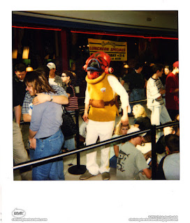
Admiral Ackbar - Mixed media head and suit - 1999 
Worn to the premiere of the Phantom Menace
 
 
Woodbane - Mask, costume, and installation - 1999 
An outdoor installation in response to a class focused on the Leon County Sinks.
 
The most frustrating thing about all of this is that it didn't need to be this way. Because it was like this, I was denied the education I went to college to get. Yes, some professors taught me a lot, but the vast majority taught me little to nothing. There were skilled artists who I wanted to learn from who would not allow me to take their classes. I ended up teaching myself and learning on the job what I could have already been familiar with. Because of bias and a heaping pile of superiority complex, my work was looked down upon and not seen to have value. I am sure we can see the irony in that now. I wanted to learn while I was in college. Instead, I had to fight for every inch and teach myself through a great deal of effort and self-motivation. I want to make the point again; there were faculty to come to defense, who welcomed me into their classes and taught me a great deal of craft and process. But I was never taught how to paint. I was never taught about composition, color, value, and a great deal more that I use every day in my work. These things I learned on my own.
 
In the summer of 1999, I was in the right place at the right time to work on a horror movie being filmed in Tallahassee. I worked on the makeup effect with a man who would eventually become my boss and learned what I hadn't in multiple years of college in a month. And I didn't have loans to repay for my time working on the movie. With what I learned that summer, I made a monster suit and did an installation and performance for my graduation show. The feet are ridiculous, but I still like the overall feel of the monster. Before graduation, I shipped it out to LA when I visited and completed it there before returning with it for the show. Within days of my graduation show, I moved to LA. I never walked in a graduation ceremony; when that was happening, I was working in LA.
 
 
Higuera - Mask, suit, instalation, and performance - 1999 
Graduation Show

A year later, I returned to my school for a visit and to see what was going on. The night I arrived happened to be the night of another graduation show. Walking around, I was amazed to see what was now allowed as graduation quality and exhibition work. I had fought tooth and nail to get permission and approval to create my monster suit and performance. My original idea was to build a spaceship that you could sit in, set up the gallery like a used car lot, and for me to be in makeup trying to sell the spaceship. I talked about this idea a lot, and when the time came, the faculty flatly turned me down and told me I could not move forward with this idea. The funny thing was, one of the exhibits that night was the most intact piece of a spaceship that a student tried to make out of cardboard. Apparently, they were going to set up this spaceship in the gallery, have people sit in it, and he was going to try to sell it.

The cherry on the top of all of this is that when I would run into faculty, they patted themselves hard on their backs and gave themselves full credit for my success. They apparently got me my job in LA. They apparently taught me what I needed to know to work out there. After years of fighting me and telling me to my face that what I was doing was NOT art in any shape or fashion, they obviously were the ones I needed to thank for making my dreams come true. I am not sure I expected anything less, but it still left me in stunned silence.

In the fullness of time, I left LA and the makeup effects industry. The tabletop gaming industry welcomed me in. I had to work hard and never take anything for granted. In the fullness of time, I returned to the world I started building in college, and I completed and published the first illustrated novel set in that world last year. I suppose I get the last laugh, but I am sure my old professors would take credit for that too.

My most favorite photo of my grandmother and I

If not for my time in college, I would not have lifelong friendships that mean everything to me. I would not have met the woman that became my wife at the graduation show a year after leaving. I would not have built the foundation of the Grand Bazaar. I would not have learned that an artist's job is actually that of a problem solver and that we need to do as much sitting and thinking as we do working. I would not have been in the right place at the right time to work on a low-budget horror movie in the summer of 1999. In the end, I only wish I hadn't had to fight so hard to learn so little.

That's all for another exciting Monday on the blog. See you back here on Wednesday! Until then...

For more samples of my work or to contact me regarding my availability, head over to my website: www.christopherburdett.com

Friday, May 7, 2021

Sibriex Miniature

Today, I have for you an outstanding miniature based on one of my illustrations. I redesigned and painted the Sibriex for Mordenkainen's Tome of Foes in 2018 and have had my fingers crossed that it would get a miniature ever since. There have been plenty of homemade miniatures based on this massive demon over the past three years, but the official mini has finally been released. I will be honest; the wait has been well worth it. To start things off, here is my painting of Sibriex.

Sibriex
Mordenkainen's Tome of Foes
11 x 14 - Digital
Art Director - Kate Irwin
© 2018 Wizards of the Coast LLC

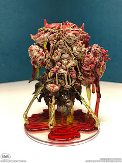
For some time, I had been under the misconception that WotC would not make a miniature of all of their monsters. For some reason, I assumed the giant or extremely complex beasts would be passed over. Time and again, miniatures based on my oversized and intricate illustrations have been made, so I knew it was only a matter of time before the Sibriex would see the light of day. WotC and Wizkids spared no experience or detail and made an absolutely massive and disturbingly accurate Sibriex. I could not be happier with how it turned out, and I am somewhat shocked with how much it looks like my illustration made flesh. On top of that, they had to create the design in the round, and after looking at what they came up with, I don't think I would have done anything differently. Here is a look at the Sibriex miniature.


The Sibriex miniature in all its glory and its gooey dipping horror.
 
A special thanks need to go out to Kate Irwin for making sure I got a copy of this miniature. I usually acquire my own miniatures, but this one has been hard to find on the secondary market. Not to mention it is a rather expensive mini on the said secondary market. Thanks, Kate!

That's all for another exciting week on the blog. See you back here on Monday! Until then...

For more samples of my work or to contact me regarding my availability, head over to my website: www.christopherburdett.com

Wednesday, May 5, 2021

Skitterwidget - Dungeons & Dragons - Process

Today, I am happy to share the process and steps that went into one of my four illustrations in the recently released Dungeons & Dragons supplement, Candlekeep Mysteries. For this installment, I am sharing the Skitterwidget. The Skitterwidget and Kiddywidget were a pair of pieces that needed to be adult and child versions of a mechanical dog-cockroach-like construct that the players would encounter. The design was entirely up to me, and I always love these types of assignments. Here is the final painting for the Skitterwidget.

Skitterwidget
Candlekeep Mysteries
11 x 14 - Digital
Art Director - Kate Irwin
© 2021 Wizards of the Coast LLC

While I am focusing on the Skitterwidget in this post, I designed the Skitterwidget and Kiddywidget in adult and child pairings. This way, production could look at the two versions and pick their favorites. I wanted them to have a familial connection and not look like two random robot creatures. Since I had free range with the design process, save for them being reminiscent of a mechanical dog-cockroach. I pulled designs from my head and worked them up or abandoned them as I moved through options. In the end, I submitted three pairs of designs.

Skitterwidget - Thumbnails
© 2021 Wizards of the Coast LLC
 
Kiddywidget - Thumbnails
© 2021 Wizards of the Coast LLC

I believe production requested the Skitterwidget options 'B' and left the selection of the Kiddywidget up to me. While that is nice to have the freedom to select what I wanted, I needed to also use option 'B' of the Kiddywidget. I really liked the Kiddywidget option 'B,' but as a pairing, my favorite was 'C.' Option 'B' was a close second. Now that I had a thumbnail, it was time to get started on the final drawing.

Skitterwidget - Drawing
Candlekeep Mysteries
11 x 14 - Pencil on paper
Original - SOLD
Art Director - Kate Irwin
© 2021 Wizards of the Coast LLC

I won't go over the ups and downs of this drawing all again as I have shared information about it enough already. The drawing was approved, and I was given permission to move forward on the painting. There was one note from my art director to make sure that there would be no confusion regarding what piece is the construct's eye. With so many circular forms and it looking back over its shoulder, I understand the need for clarity. Here is the painting of the Skitterwidget taking shape.

Skitterwidget - Process
© 2021 Wizards of the Coast LLC

I painted the Skitterwidget before the Kiddywidget so that I had an adult version of the color palette and overall material guide to then adjust to the child. I will share more about that when I share the process on the Kiddywidget. For this painting, it was mostly about locking in the materials and textures to read like a mechanical creature. It needed to look like it was made of brass, silver, and other less precious metals. I also wanted to give it some wear and tear as if it has been scuttling around a dungeon or castle for a while. It needed to have that lived-in feel. The electric stinger tail was part of the description, and it needed to feel like it was a threat. I leave these types of things generally to the later stages of the painting unless the light generated from them will affect the overall palette or local color of the forms. I also make sure to paint magical and light effects like this on separate layers so that they can be removed easily or changes quickly. After having to go back in and make a significant edit to lighting or an effect of this nature, to learn that it is sometimes worth the extra effort and time upfront to make things much easier at the end if something should change. Here again, is the final painting for the Skitterwidget.

Skitterwidget
11 x 14 - Digital
© 2021 Wizards of the Coast LLC

That's all for another exciting Wednesday on the blog. See you back here on Friday! Until then... 

For more samples of my work or to contact me regarding my availability, head over to my website: www.christopherburdett.com