Descent: Dark Elements
12 x 12.5 - Digital
© 2015 Fantasy Flight Games
As the cover of a Descent expansion the piece needed to fit certain parameters. There needed to be a lot of bleed at the top for the type which resulted in an almost square layout. As with all of my assignments, I got started on some thumbnails. I envisioned a very dynamic scene of the Merroid splashing out of the water...
Descent: Dark Elements - Thumbnails #1
© 2015 Fantasy Flight Games
It turns out that production was looking for dynamic at all. They were looking for something more eerie and moody with the Merroid slowly rising out of the water. This meant all the thumbnails get scrapped and a new set needed to get created...
Descent: Dark Elements - Thumbnails #2
© 2015 Fantasy Flight Games
This time around I was more on target with what production was looking for. There were still a couple more notes to be addressed, but I was definitely on the right track now. Here is the updated and finalized thumbnails...
Descent: Dark Elements - Thumbnail #3
© 2015 Fantasy Flight Games
With an approved thumbnail it was time to work up the drawing. This one was really straight forward, big monster in the water... RAWR! Here is how the final drawing turned out...
Descent: Dark Elements
11 x 14 - Pencil on paper
© 2015 Fantasy Flight Games
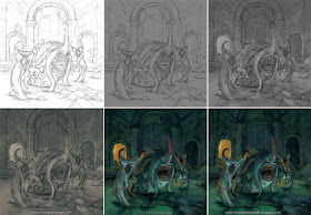
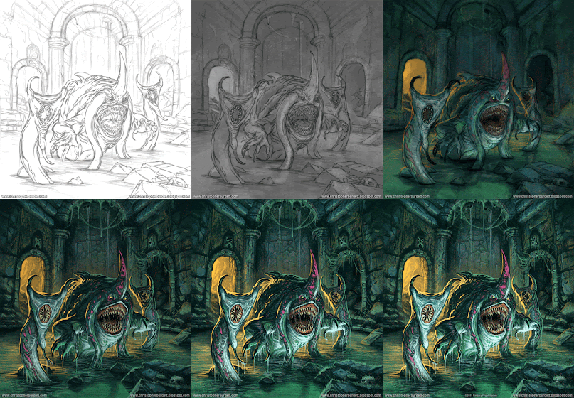
There was one small tweak of the drawing once I was done with it, but that could be addressed in the painting process and did not require an edit to the drawing. It was time to paint! At this time I did this piece I was still working 100% digitally, though depending on the client, I most likely would approach a cover these days digitally too. But you never know. In just twelve easy steps the cover to Dark Elements comes together... or now. I know I say this a lot, but this one was really straight forward. No issues or catastrophes along the way. They happen, but not on this assignment. Here is a look at the piece coming together step by step...
Descent: Dark Elements - Progress progression
© 2015 Fantasy Flight Games
To better illustrate the painting taking shape, here is an animated progression of the process...
Descent: Dark Elements - Animated process progression
© 2015 Fantasy Flight Games
Except for the tentacle mouth rotation that was requested by production after the drawing was turned in, a stretch and squish of the background early on, and a rock that I moved the painting stays as it was originally planned. Always nice when a piece behaves itself! Here again is the finalized painting and an image of the packaging featuring the illustration for your viewing pleasure...
Descent: Dark Elements
12 x 12.5 - Digital
© 2015 Fantasy Flight Games
Descent: Dark Elements packaging
(image courtesy the FFG website)
That is all for another exciting Wednesday on the blog, see you back here on Friday! Until then...
For more samples of my work or to contact me regarding my availability head over to my website: www.christopherburdett.com


No comments:
Post a Comment